MoM | 2019W01
What Works Well?
The teams are listed in alphabetical order, so it makes it easy to quickly find your team of interest. With the attendance being presented in bars, you can compare across the vertical axis. However, with the teams alphabetically rather than descending attendance numbers, it might be difficult to see how two teams of similar attendance actually compare (eg. Florida and St. Louis). The red label for the % change YoY also allows quick identification of teams with a decrease in attendance.
What Can Be Improved?
This visualization focused on one year and it (moreorless) delivers on that. Unfortunately this is just a snapshot in time (with data only through early February for the current year: 2013) and you can’t see if a team is just having a bad year or if it’s been a trend for several years. While the red label quickly indicates a decrease in YoY, I do find it a bit odd to have the axis not aligned at 0. It would be even quicker to note which teams increased/decreased on last year’s numbers with axis synchronized at 0 with decrease in attendance going below the axis.
My Approach
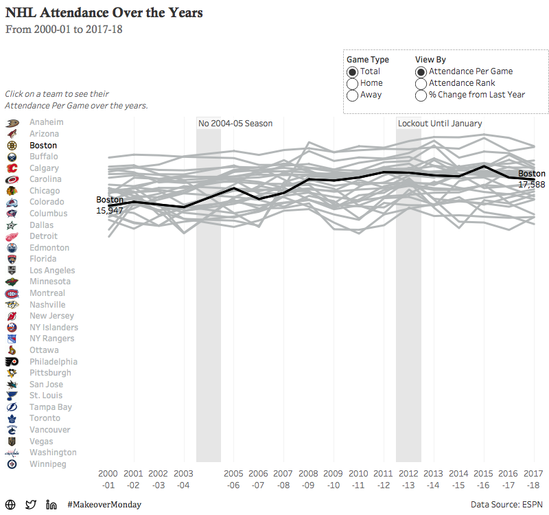
I recently finished the #MakeoverMonday book which expanded on previous readings (such as STWD by Cole Nussbaumer Knaflic) that discussed focusing on one particular category, such as a team. I kept this in mind as I went about designing the dashboard.
Set Actions has been a large focus in Workout Wednesday since the release of 2018.3 and I believe it really opens up a new realm of possibilities in Tableau. Teams are listed alphabetically and the team that you’ve selected is highlighted black to tie in with the trend chart. The associated logos directly next to the names to facilitate at least some of the emotional connection a person might have with a team.
There were only two annotations I wanted to make:
2004-05: there was no season played due to a labor dispute (more info here)
2012-13: the season did not begin until January (instead of October) due to expiration of the league’s CBA (more info here)
One other item I was curious about myself is comparing year to year for a team, particularly when you’re looking at Rank or YoY Change as your metric. If your team dropped down in attendance rank, you’d naturally be curious if you had a large decrease in attendance. I attempted to address this with a viz in tooltip showing attendance by year for the team you’re hovering over.
This is actually my first Makeover Monday, so any feedback is appreciated! Thank you!


