MoM | 2019W03
Makeover Monday
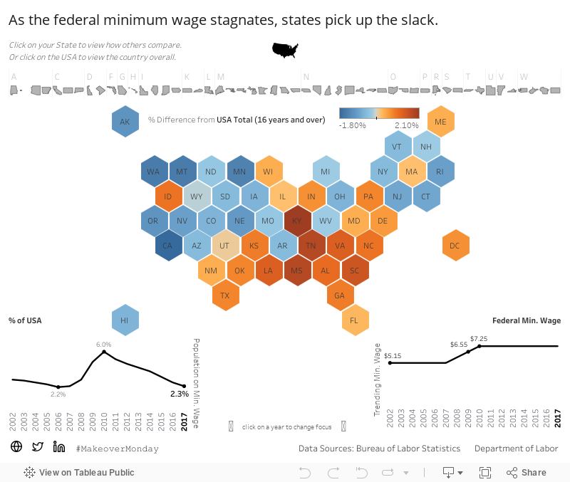
2019W01 - How many people earned the Federal minimum wage?
Here’s the original visualization:

What works well?
The map separates states into just 4 groups of % of workers earning minimum wage. These 4 groups use a friendly color palette that ranges from a dark blue to a very light blue, which allows you to identify where your state ranks pretty quickly.
How can it be improved?
Admittedly, whenever I see a map of the USA now I immediately think of the ‘Alaska effect’. Granted, they resize Alaska in this case, the continental United States remains the same and that makes it hard to compare states like Texas and Rhode Island. The article makes one reference point to 2015, but there’s no trending view available. I’m particularly interested in data since 2010 due to this being the last year the federal minimum wage was raised.
My approach
My work focuses on hospital metrics, so I never get to do much with maps. I like to seize the opportunity to make a Hex map whenever possible. Once again, I felt obliged to use user-friendly Set Actions to allow the end user the ability to click around and see things happen. My thought quickly went to a tweet I had seen that allowed the user to change the state to compare against using a simple click.
HexMap and Comparison
I initially began using Rody Zakovich’s polygon approach to build the hexmap, but ran into issues when wanting to do a calculation that isn’t allowed during a blend. Rather than trying to make it work, I pivoted to use Matt Chamber’s methodology using a hexagon shape. This allowed me to join the data prior to bringing it in.
I immediately made a set (SetState) and set it to the USA (“Total, 16 years and over”) knowing I wanted this to be the default comparison. In order to get this to work, I elected to identify the state in the set by using a window calculation in hopes to not hurt performance with a level of detail expression, likewise for the selected state’s resulting percentage.
Following this I was able to create a simple comparison calculation to color the states with 0 being set as the middle. We typically use the color-blind friendly orange-blue indicators, so I followed this approach here. I added some additional fields to format the tooltips in an easy to read manner.

Note: due to Set Actions requiring two clicks (one to set, one to unhighlight) prior to comparing, I decided to make small state icons above the map that can function as the primary buttons. Whichever state you select is colored black and its abbreviation is emphasized with both size and color.
State vs Federal Government
The Fight for $15 has been in headlines over recent years. This movement along with pressure from citizens has seen many states raised the minimum wage at a much more rapid rate than that of the Federal government. For instance, California has raised the rate twice in the last few years: $9 in 2014 and $10 in 2016. This sees their % of population earning minimum wage well below the national percentage. With this in mind, I was curious to look at the % of population making minimum wage and what the minimum wage actually is during those years.

My current state, Massachusetts, has raised minimum wage over the years and has been outperforming the USA overall until this past year.
With Massachusetts selected, we can quickly identify which states have a lower percentage of their respective populations earning minimum wage - California immediately jumps out. Furthermore, the axes on both the trend charts are set actions as well. The trend chart shows 2010 had the highest % of of the US workforce earning minimum wage, so you might want to see what it was like in your state at that year.

2010 saw the highest % of the US population earning minimum wage over the last 15 years. We can a large portion of the midwest and south east were worse off than the country overall with the orange coloring.

Static Image
Dashboard: